
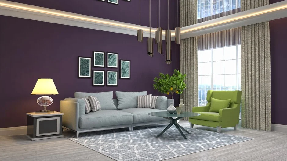
Colour advice written for a house in Surrey does not transfer to a flat in Lekki. The light is different, the walls are different, and the reason a scheme fails here is usually not taste.
Start with the light
Nigerian daylight is strong, high and slightly warm. It comes from a steeper angle than northern European light and there is a lot more of it.
Two consequences. Pale, cool colours that look chilly in a magazine shot from London read as clean and comfortable here, because the light warms them up. And strong warm colours that look cosy in a European interior can tip into oppressive under our sun, because the light is already supplying the warmth.
So the usual advice about warming a room with terracotta is often backwards in Lagos. A soft cool grey or a green-leaning off white will feel calmer in a south-facing sitting room than a cream will.
Which way your windows face still matters. A north-facing room gets consistent indirect light all day and can take a warmer colour. A west-facing room takes strong orange light from about four o’clock, which will push any warm colour further warm. Look at your shortlist in that late afternoon light before deciding.
Off white is not one colour
Most Nigerian sitting rooms end up broadly neutral, and that is a sound instinct. Furniture, fabrics and art carry the colour, and the walls give them room to work.
The mistake is treating white as a single option. In our colour library there are hundreds of near-whites, and the difference between them is the whole decision.
A neutral grey-white such as NCS S 0500-N is genuinely neutral and will not fight anything in the room. A warm off white leans yellow and reads softer, which suits rooms that get less direct light. A cool off white leans blue or green and reads crisp, which suits a bright room that already has plenty of warmth coming through the windows.
Put three candidates on the wall next to each other. On their own they all look white. Side by side the differences are obvious, and you will have a clear preference within a minute.
Building a scheme
The usual proportion that works is roughly 60 per cent dominant colour, 30 per cent secondary, 10 per cent accent. In a sitting room that is walls, then upholstery and curtains, then cushions and art.
Deciding the ratio matters more than deciding the colours. Most rooms that feel wrong have three colours all fighting for the same share of attention.
Practical combinations that suit our light:
- Warm off white walls with deep green upholstery and brass or wood accents. Forgiving and works in most light.
- Soft grey walls with terracotta and cream. The grey keeps the terracotta from overheating the room.
- Deep blue-green on one wall, off white elsewhere. Gives the room a centre without darkening it.
- Sand or clay walls with white joinery and dark timber. Warm without going orange.
If you want something bolder, put it on the wall behind you rather than the one you face. A strong colour behind the sofa is a background. The same colour on the wall you look at all evening becomes the room.
Bedrooms want less contrast
A bedroom is looked at last thing at night under warm bulbs and first thing in the morning under strong daylight. That is a wide range for one colour to survive.
Lower contrast schemes handle it better. Walls and bedding within a few steps of each other, with the contrast in texture rather than colour, stay comfortable at both ends of the day.
Muted blues, soft greens, and warm greys all work. Full saturation rarely does, because a strongly saturated colour that felt calm in daylight will look heavy under a single warm bulb.
Test bedroom colours at night specifically. It is the one room where the artificial light matters more than the daylight, and almost nobody checks it.
How to test properly
Paint a patch at least 30 centimetres square. A small dab surrounded by your existing wall colour tells you nothing useful, because the eye reads colour relative to whatever is next to it.
Better still, paint two coats onto a sheet of card and move it around the room. You can hold it against the sofa, put it in the darkest corner, and look at it by the window without committing paint to the wall.
Look at it three times: morning, late afternoon, and at night under your own bulbs. Warm LED bulbs pull colours yellow. Cool white bulbs pull them blue. The bulb you own is part of the decision.
Let it dry fully. Emulsion looks different wet, and most of our interior products take about 3 hours.
Record what you use
This is the part people skip and regret. Write down the exact notation, not “the cream from the sitting room”.
We tint to order from a library of over 2,400 notations across the NCS and RAL systems, and each entry on the site lists its hex, RGB and HSL values along with the nearest alternatives. If you note the reference, you can reorder the identical shade in three years for a touch up. If you do not, you are matching by eye against a faded wall.
Keep a note of the finish too. The same colour in matt and in satin will not look the same, so a touch up in the wrong sheen shows even when the colour is right.
A note on trends
Colour trends move faster than repainting cycles. If you repaint every five years and pick this year’s colour, you spend most of that time living with something dated.
The colours that age best are the ones close to neutral with a slight temperature bias, because they read as deliberate rather than fashionable. Save the trend for the cushions, which cost far less to change.
If you want help narrowing a shortlist, browse the colour library, note two or three references and send them to us. We will tell you what they look like in the products you are considering, and mix samples before you commit to the whole house. Get in touch.